


14
The Catholic Foundation 2025 Annual Report

30
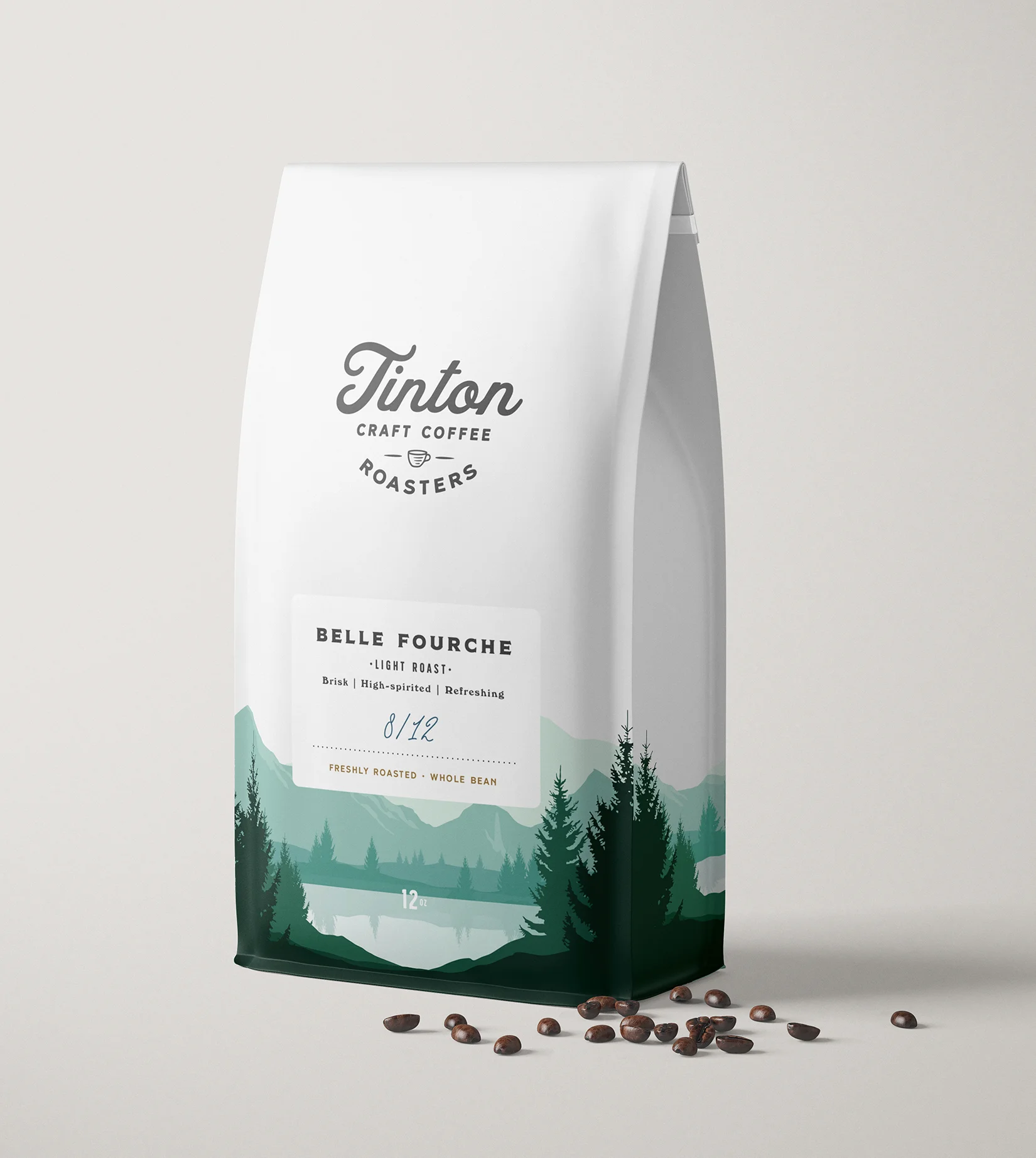
Tinton Craft Coffee Roasters
16
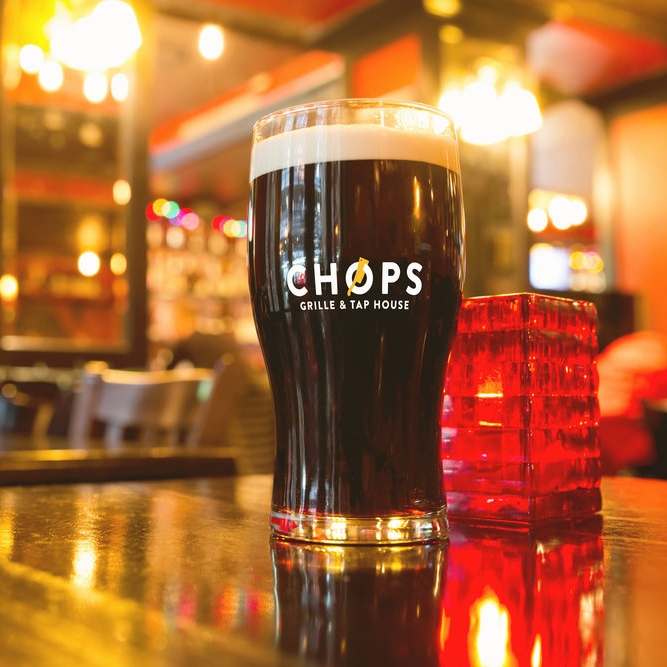
Chops Grille & Tap House

20
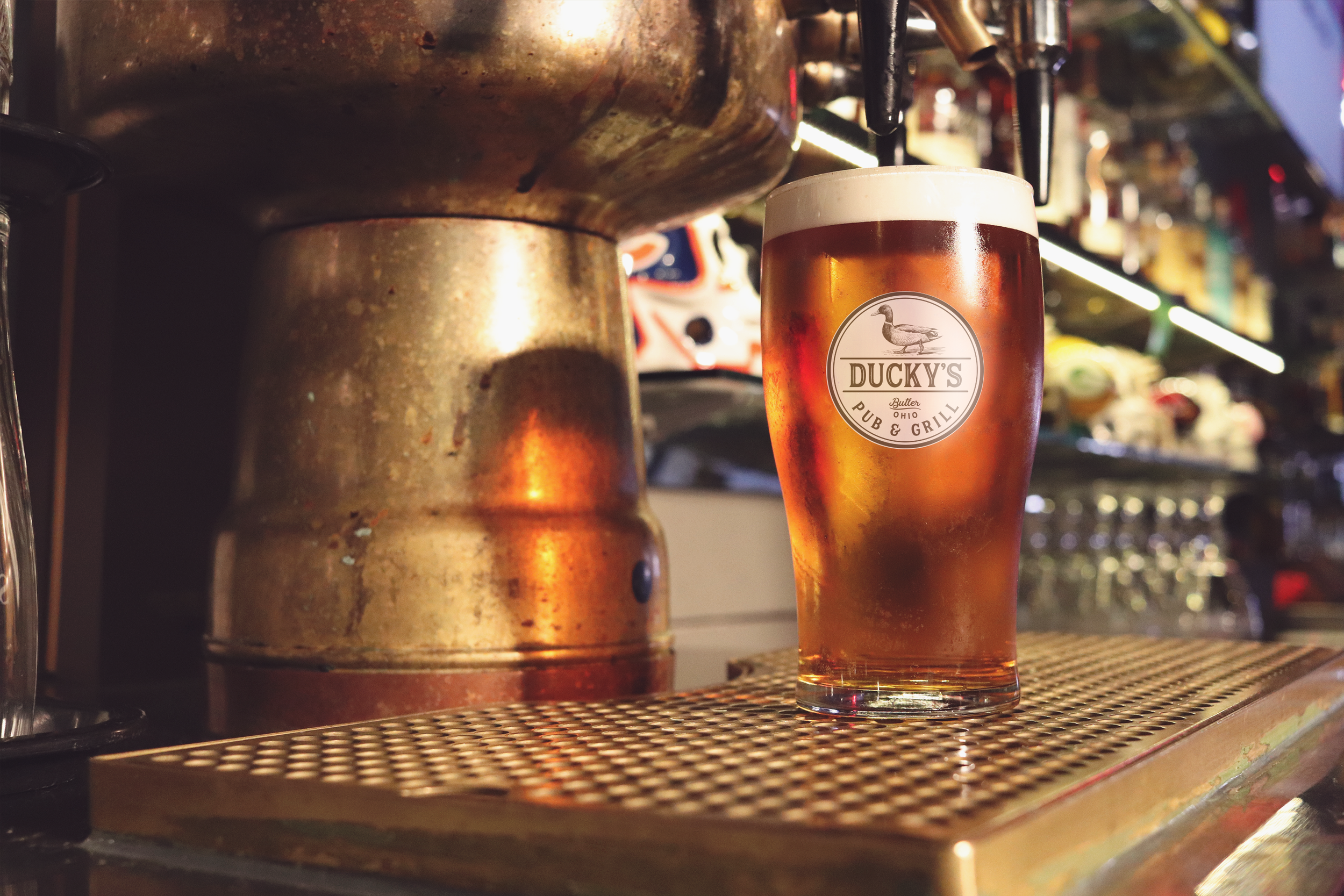
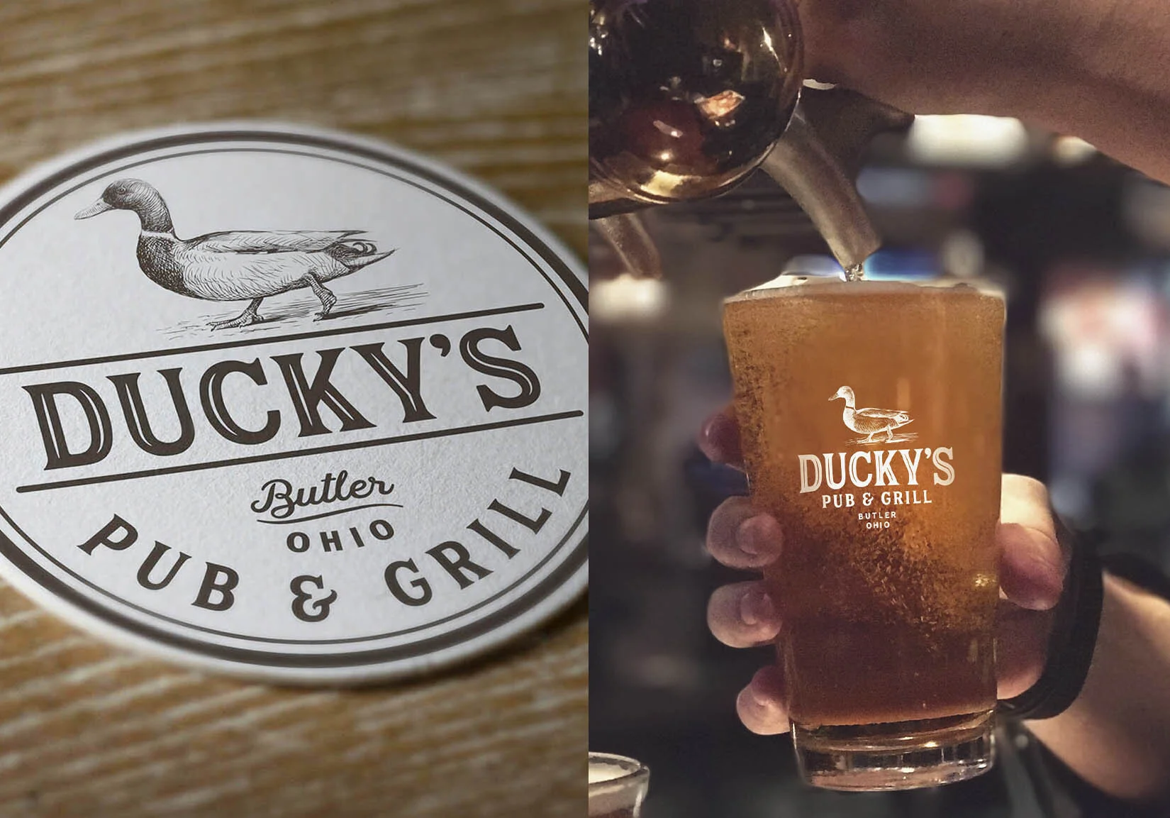
Ducky's Pub & Grill
12
Xfinity

21
Level One Bar+Arcade

33
Logos

26
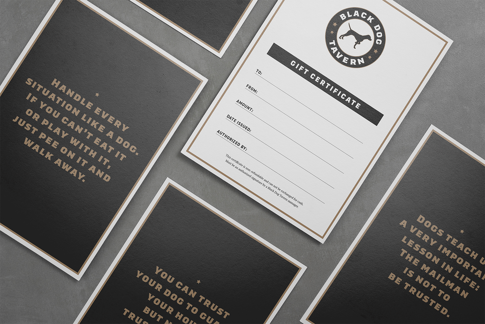
Black Dog Tavern

9
Red Team Investments

4
Adecco

21
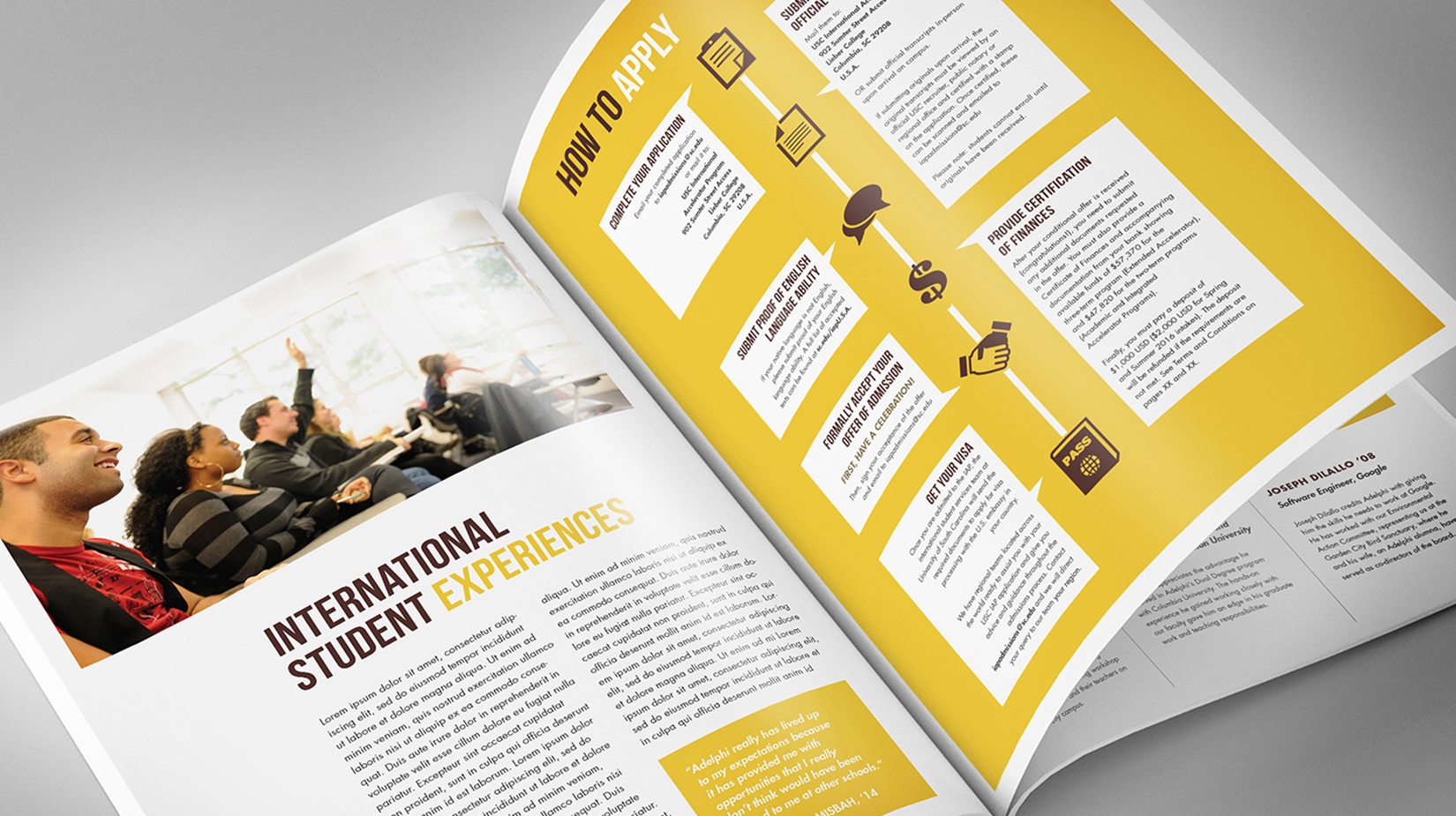
Shorelight Education Guidebooks

15
Brittany & Gabe
4
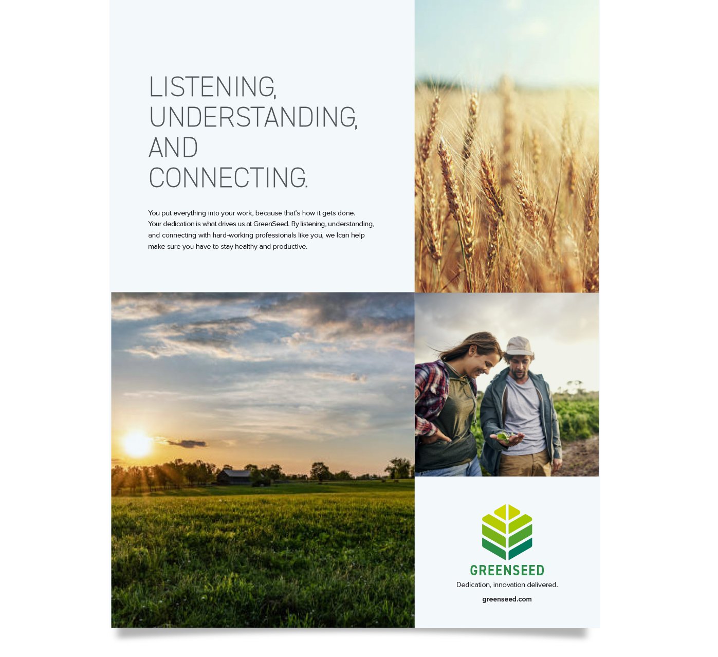
GREENSEED

5
Big Lots logo Branding

13
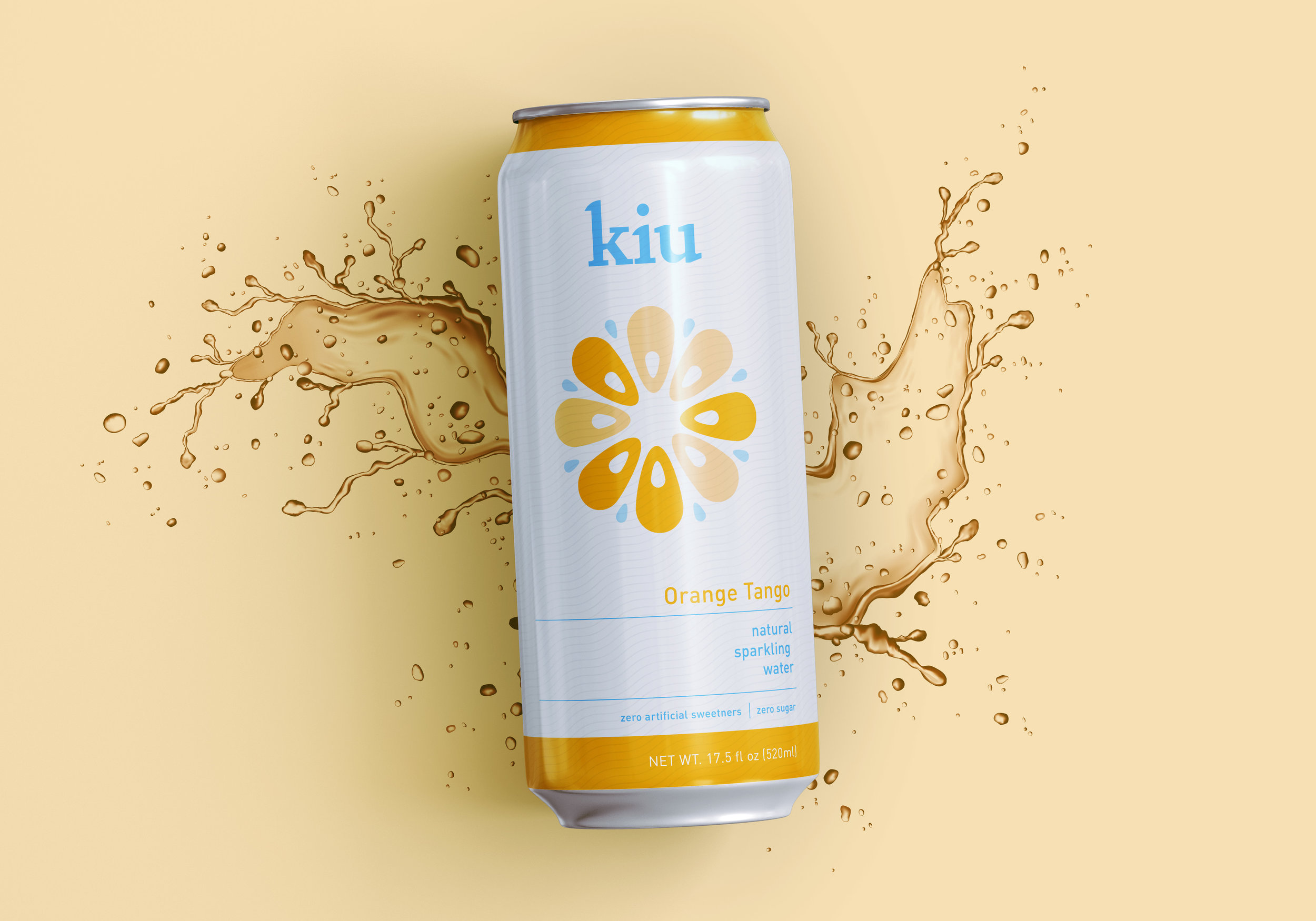
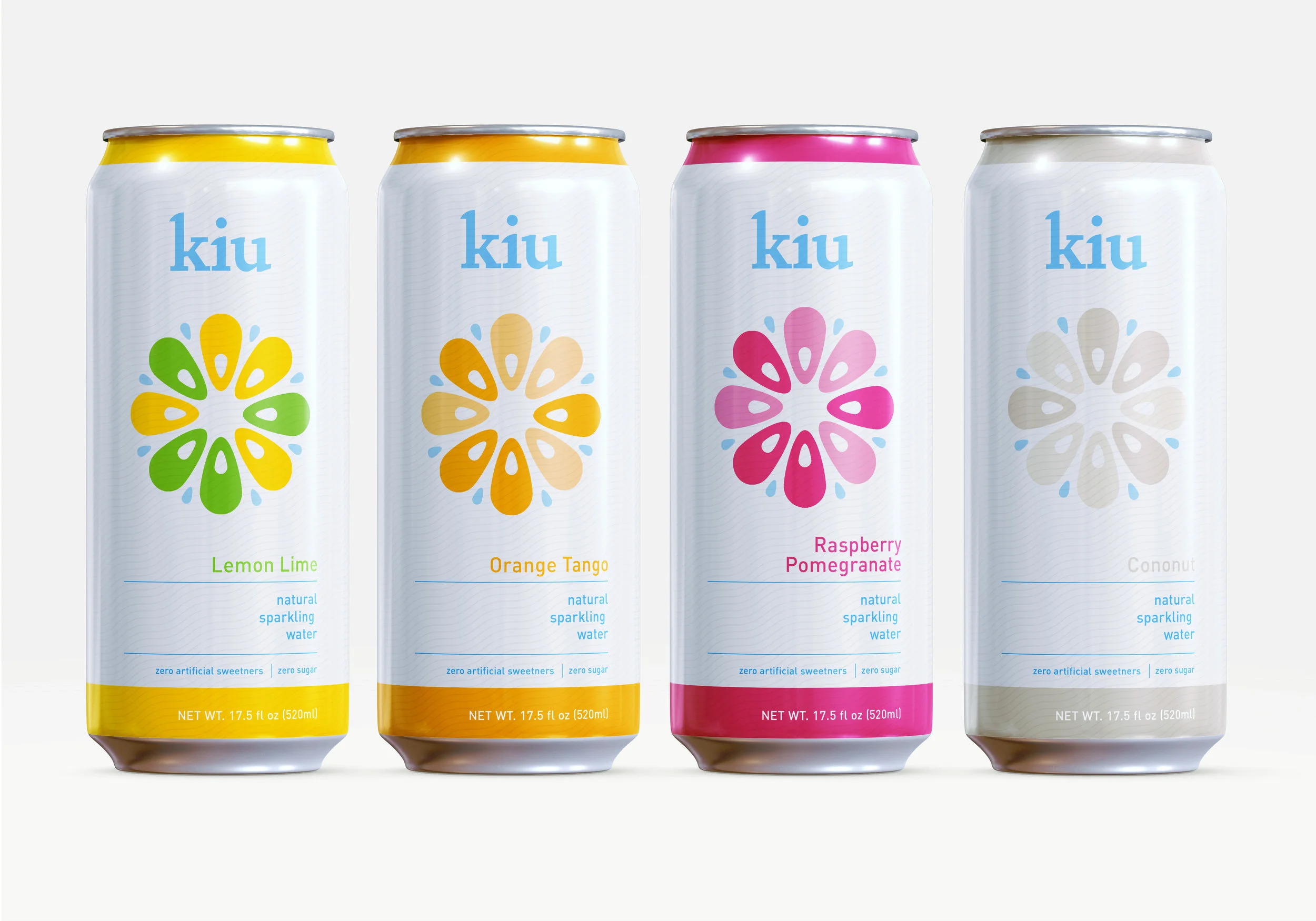
kiu

5
ELZY Identity Update

3
Big Lots Big Deals

25
Digital, Web and Social Media Design

4
Makley Place

8
buy buy Baby

6
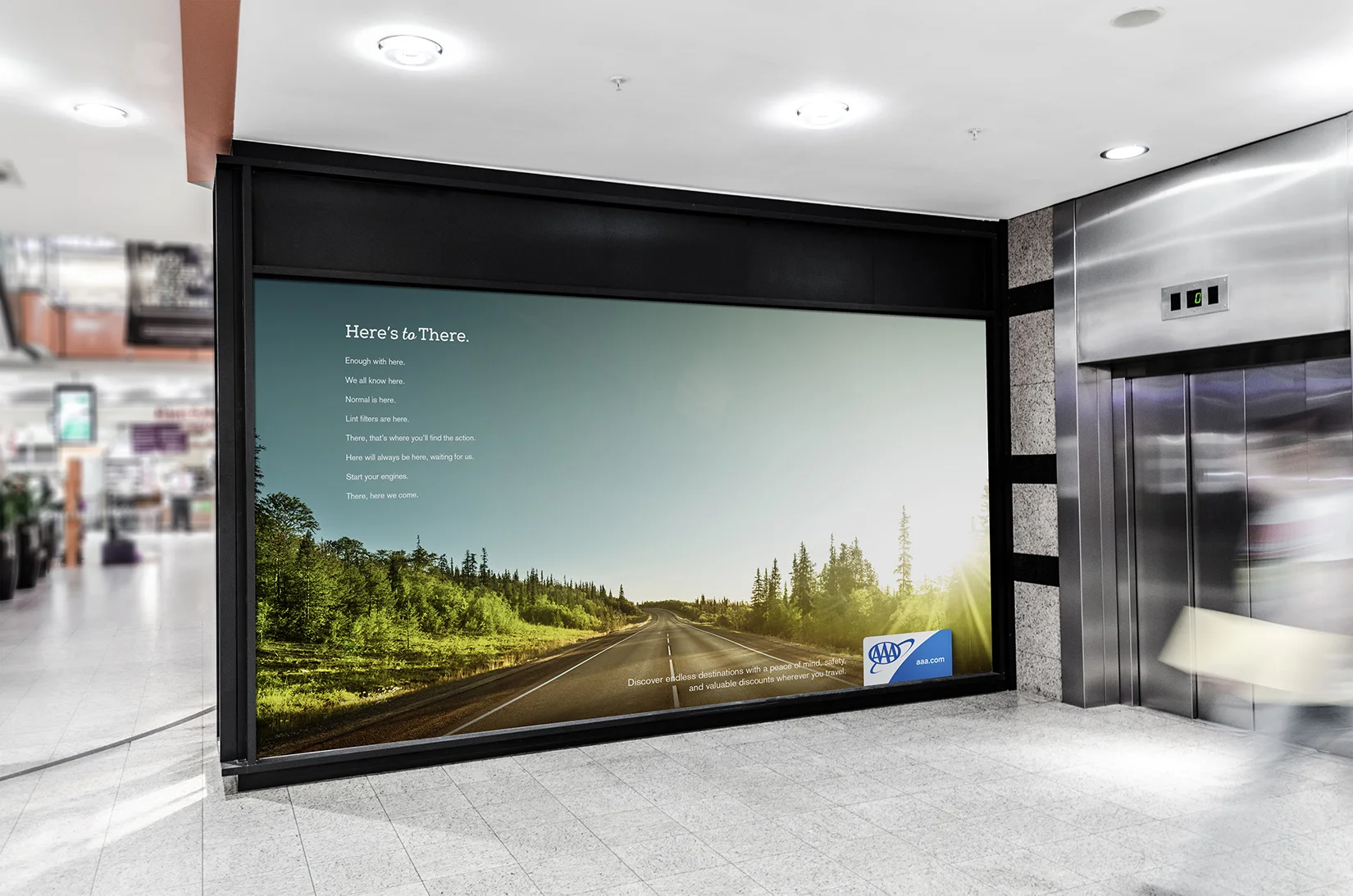
AAA

8
Bath & Body Works
6
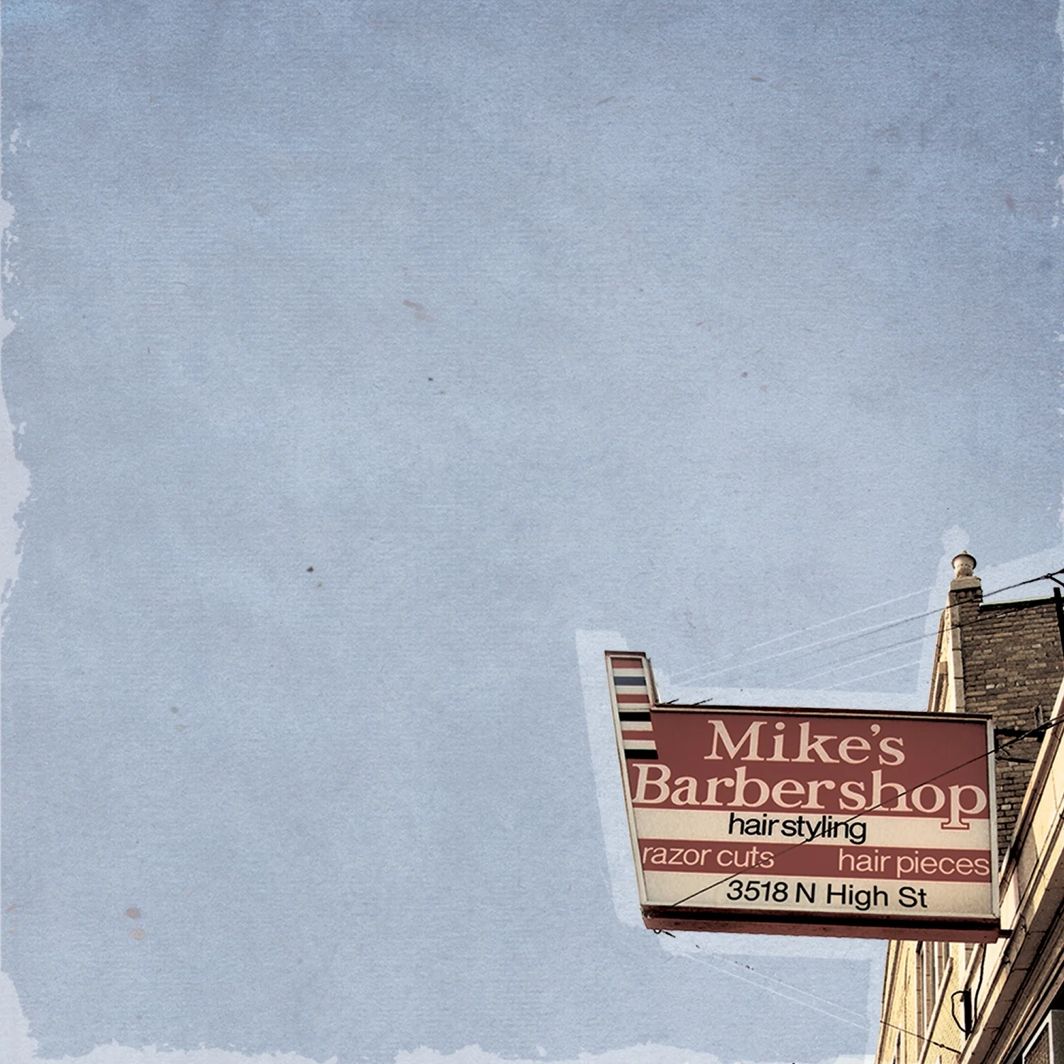
Mike's Barbershop

18
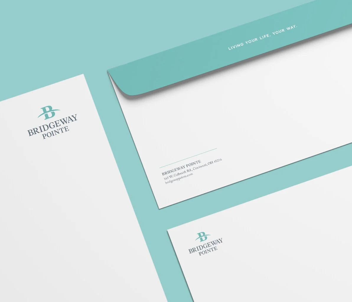
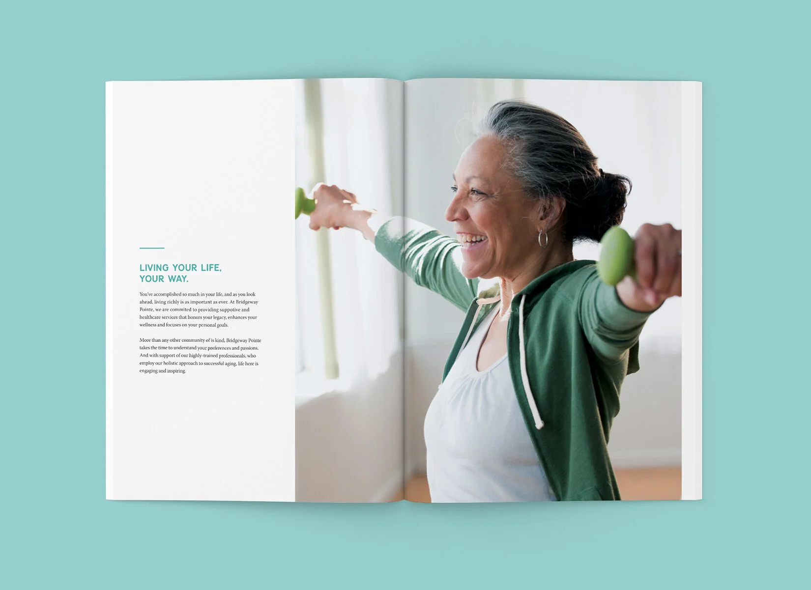
Bridgeway Pointe

2
Patriot Preparatory Academy

4
Trumbull Tree Farm

26
Package Design

6
Park Lanes

2
2025 Vision Pelotonia Jersey

3
Abbott – Pelotonia

3
WhiteSpace Cornhole Tournament

29
Art Direction-Photography
7
Healthcare 101

5
Bob Evans